
Stylehub.
Client
Stylehub Ecommerce Ltd.
Roles
Visual identity, Website design, Frontend development
Technologies
HTML, CSS (SASS), JS, jQuery, React.js, Node.js (Gulp), Twig, Figma, Adobe Creative Suite
Summary
Stylehub aimed to be the first, truly global ecommerce platform designed for the needs of fashion, design and lifestyle brands, providing an all-in-one tool without the need for plugins, apps or add-ons. The platform had built-in multi-language and multi-currency capabilities, and offered several fully customizable, high end templates.
I joined the team in 2018 to come up with a brand new, distinctive visual identity, and an accompanying website for Stylehub. I also designed several store themes and a theme building framework. Last but not least, I also took part in the design, development and refactoring of Stylehub's React based admin interface.
Visual identity
I was tasked to create a visual language that steers away from the conventional, often too techy and dry SaaS look and feel, appeals to the refined taste of our target audience, and at the same time expresses the high end nature of Stylehub's services.
Getting the SaaS out of SaaS is not an easy job, and the designs went through multiple iterations until I arrived to the end result that conveys the message we want to get across, featuring a minimalistic, contemporary, playfully rebellious and at the same time elegant look.
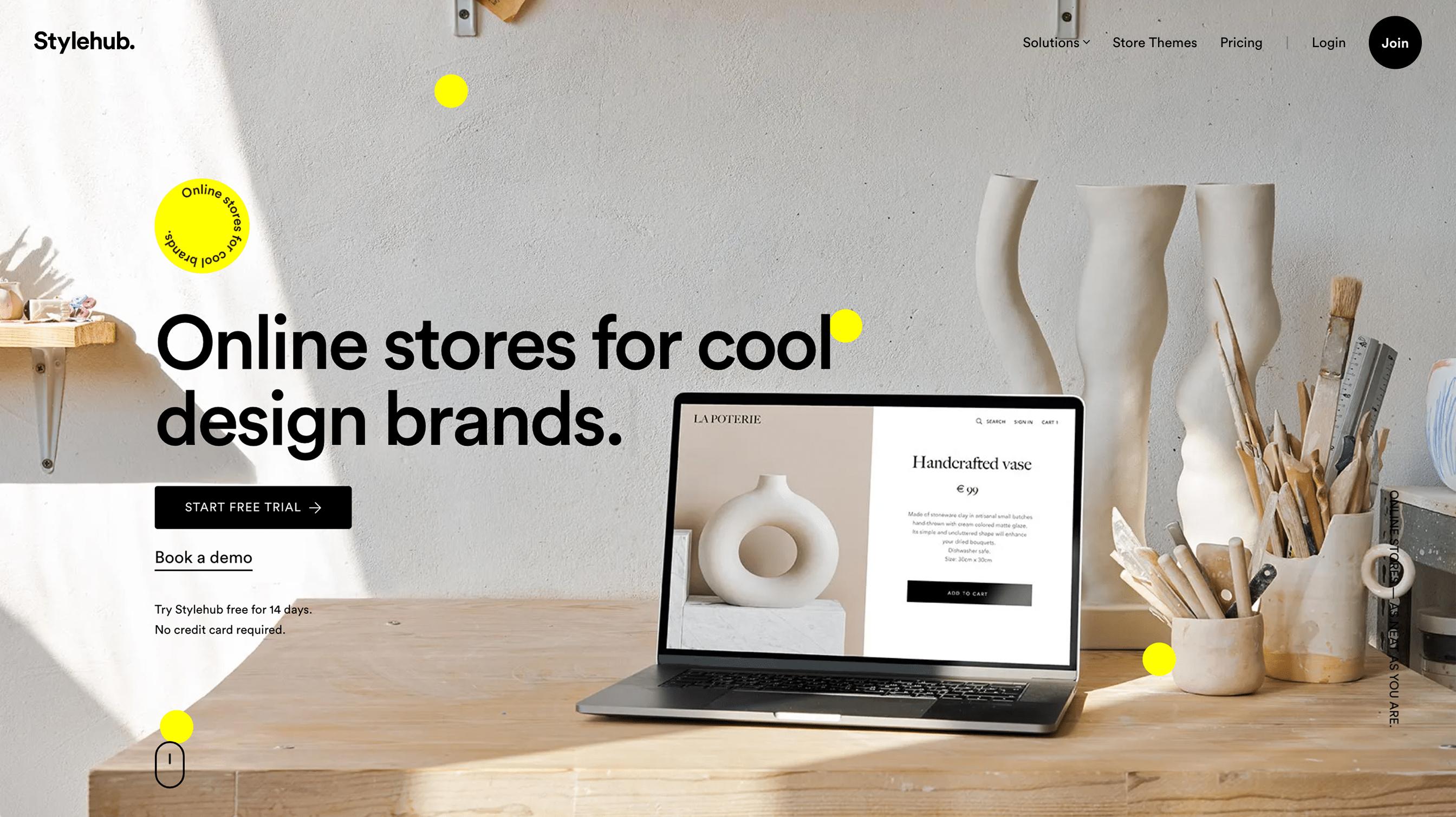
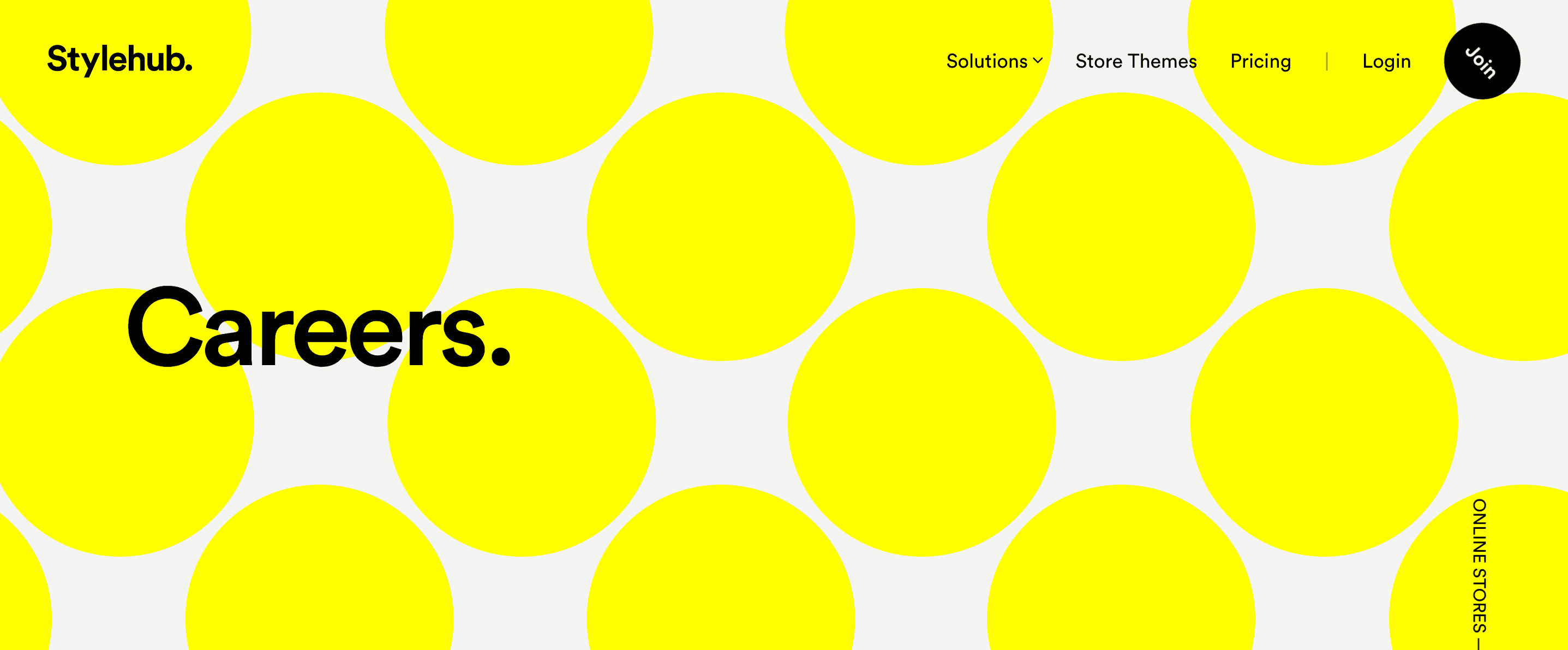
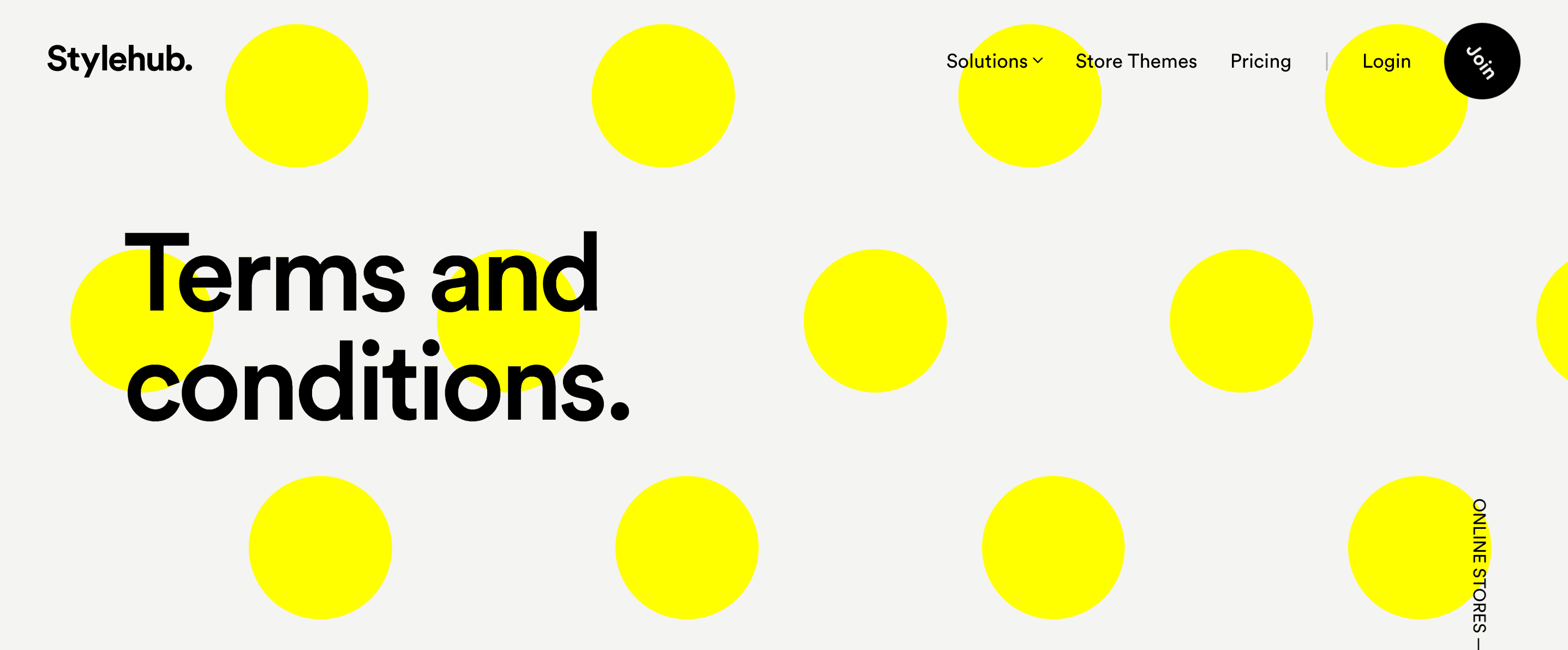
To capture this style, I decided to go with unapologetically vibrant colors. Stylehub's primary accent color, with its hexadecimal code #FFFF00, is the most in-your-face yellow it can be, and Stylehub's secondary accent color blue leaves no room for subtlety either.
Another important aspect of Stylehub's visual identity is the striking typography. I believe the fantastic Circular typeface embodies the brand perfectly. It also looks absolutely stunning when scaled up, allowing us to create all sorts of playful typographical effects. Stylehub's logo is also based on the same typeface, with a small tweak done by Hungarian design agency Zwoelf.
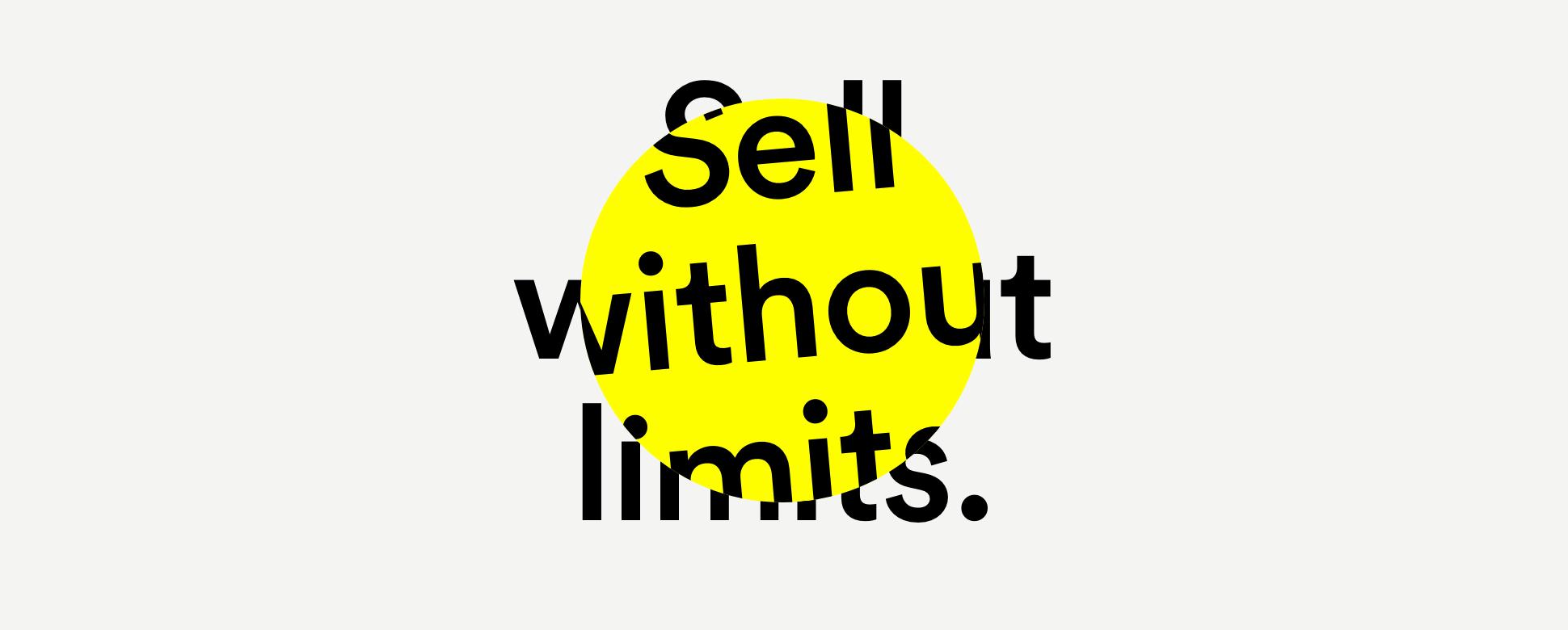
To emphasize the rebellious, fashionista feel even more, we're using a lot of repeating geometric patterns, stickers and badges, and elements that break through the constraints of the traditional layout. The circle, one of the most basic shapes in the world, is a key part of Stylehub's visual language, and it appears in many different roles. Some of these ideas were conceived together with Hungarian design agency De_form.
The website
Stylehub's website features a grid based, fully responsive, mobile-friendly design. Because of our target audience I made sure that users with especially large screens would also have a great experience by adding one more responsive breakpoint to the usual mobile / tablet / desktop trio.
I designed a number of different reusable content block types, including several different hero sections, giant summaries, images with text, feature lists, testimonials, call to actions, and several blocks where either the text or the image breaks out of the grid to make the presentation more exciting. With these flexible blocks new content pages can be launched quickly.
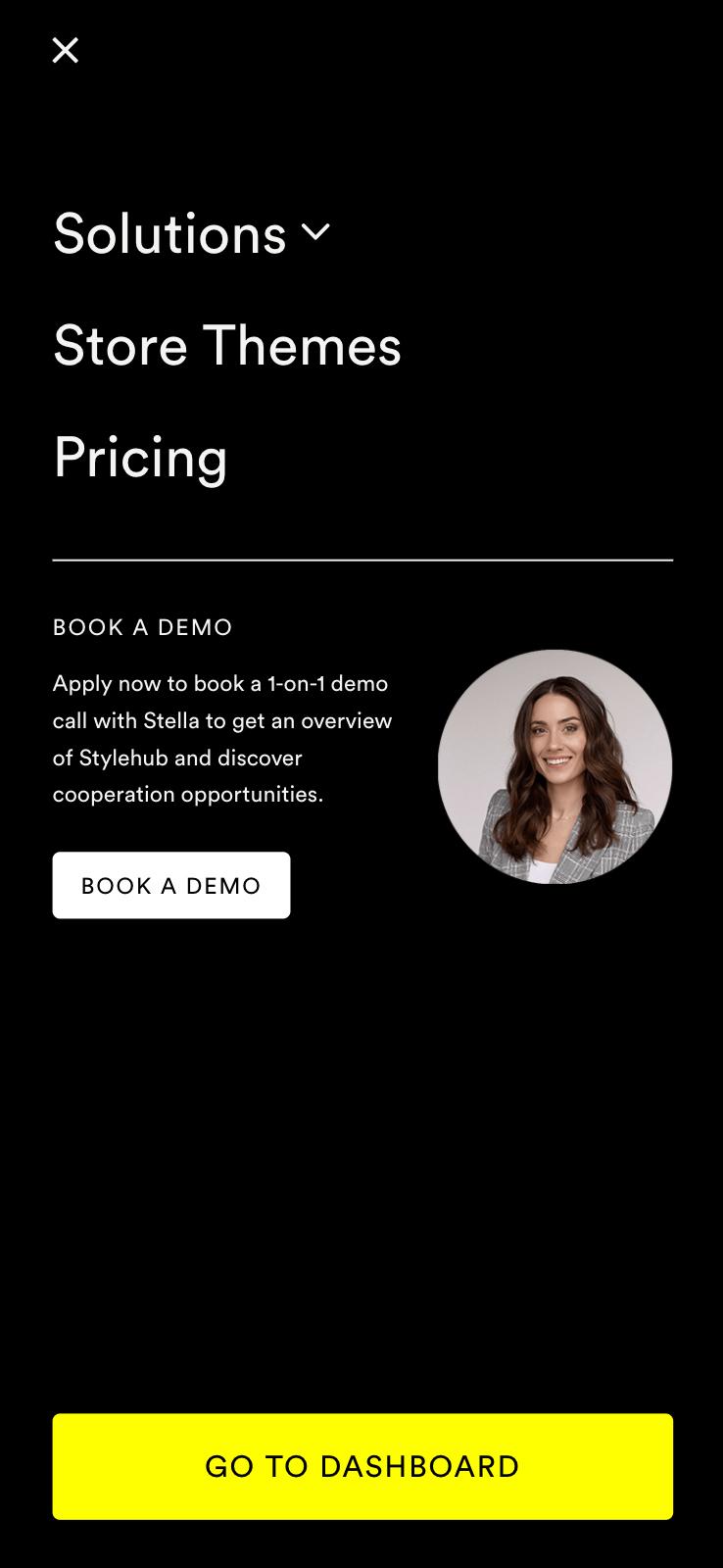
Navigation
Stylehub's main navigation sticks to the top of the screen. It has a transparent background, and as we scoll down the page, the overlapping text creates an interesting typographic effect.
The main menu consists of four main items: Solutions, Store Themes and Pricing, and depending on whether the user is signed in, a Sign up button or a link that takes the user to the app.
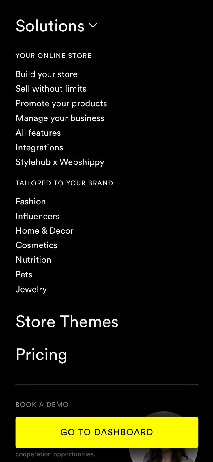
Solutions is a megamenu itself, with a nice opaque background that slides down with a slight zoom effect when we hover over the menu item. This is where the main content resides, including the 4 main topics introducing our USPs called Build, Sell, Promote and Manage, and various industry tailored landing pages.
On mobile devices the navigation is placed in a drawer that slides in from the left. The tablet layout is a little bit different from the mobile version, as I was able to use 2 columns due to the larger screen real estate. On mobile phones, the call to action button is always visible at the bottom, even when the megamenu is open, and it hovers above the scrollable menu, creating an interesting depth effect.
Store Themes got a prominent place in the header due to the highly visual nature of Stylehub's potential customers — one of the first things everyone wants to know is what kind of themes are available, and therefore it's a vital user journey towards onboarding.
Another user journey — booking a demo with our sales team — proved to be less successful than we hoped during our tests. We learned that instead of chatting, most people prefer to try the software on their own instead.
Interactive animations
Sometimes it's way easier to get a point across by using interactive visuals, and the added benefit is that they also make the page come alive. Together with the marketing team we came up with a few ideas on what concepts we could illustrate this way.
I have two examples here, one illustrating Stylehub's scheduled pricing feature using a minimalistic day and night cycle, and another one for order fulfillment showing all the automatic processes happening behind the scenes.
Both animations feature realtime trigonometry and tweening, and they also adapt to the users' viewport size automatically, just like the rest of the website. Order fulfillment also has randomized delays to make it feel a bit more organic.
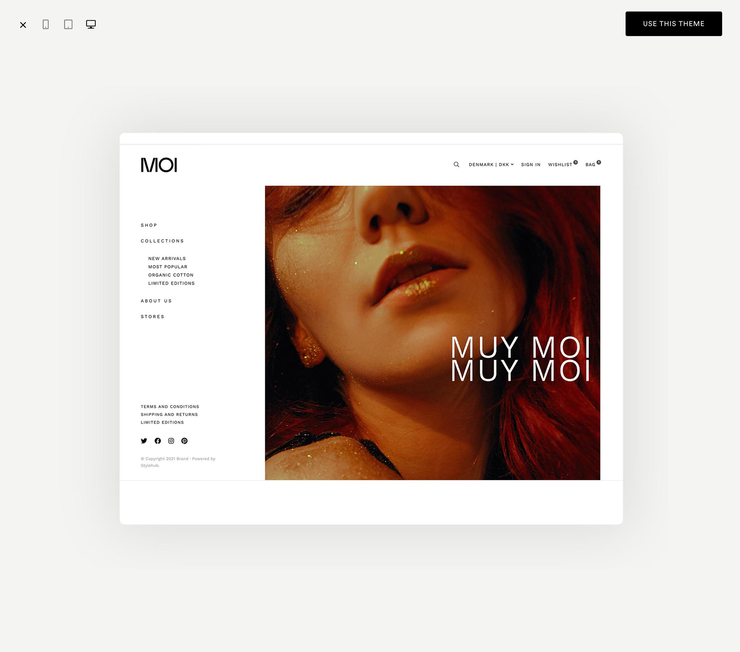
Store themes
Store themes are an essential part of any ecommerce platform. I designed an entire section where customers can learn more about Stylehub's theme offering and the dozens of fully customizable content block types that are available for each of them.
With the help of the marketing team we put together live demos of all available themes. Customers can see how they look like and behave on different screen sizes, and are encouraged to sign up by clicking on the "Use this theme" button.

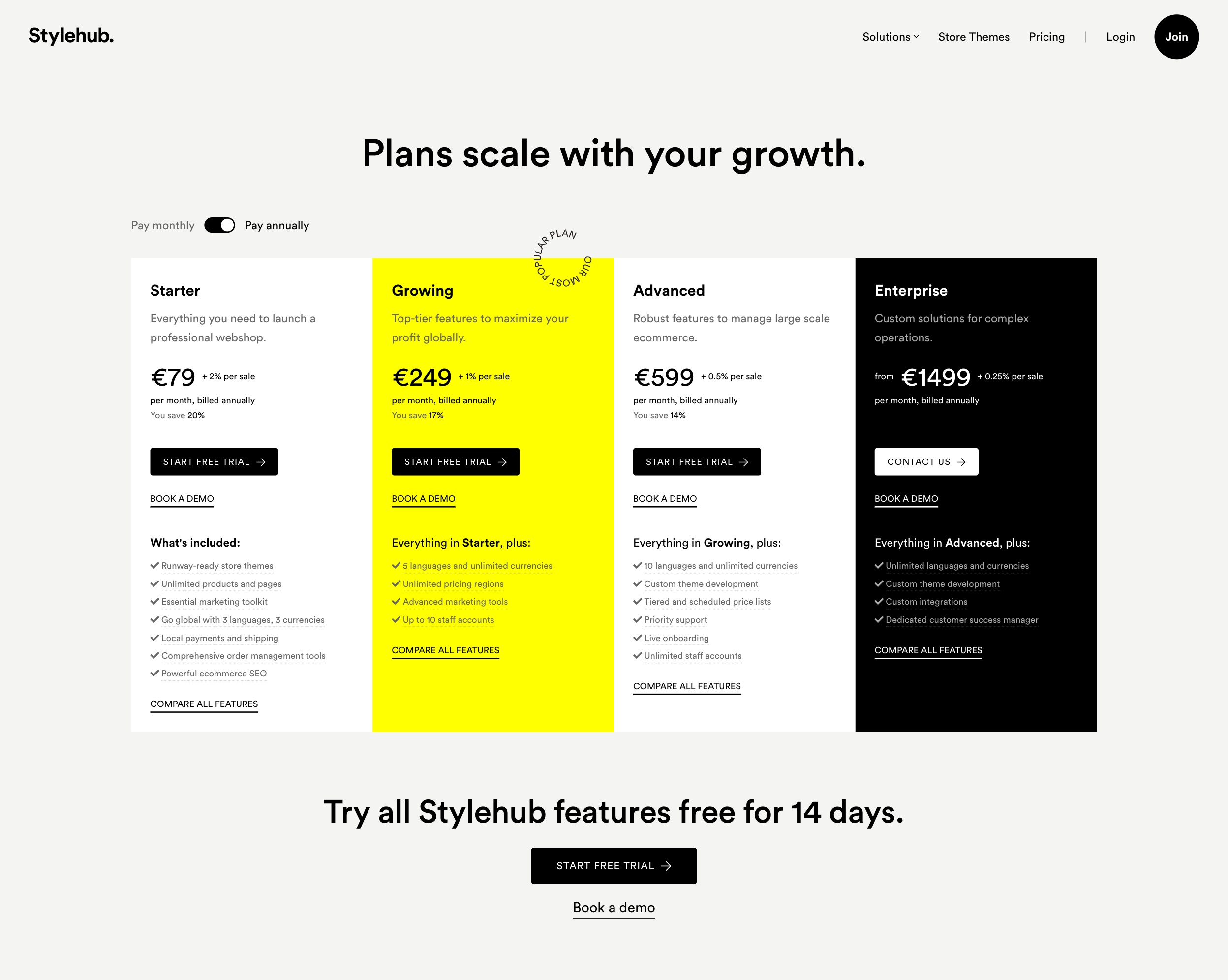
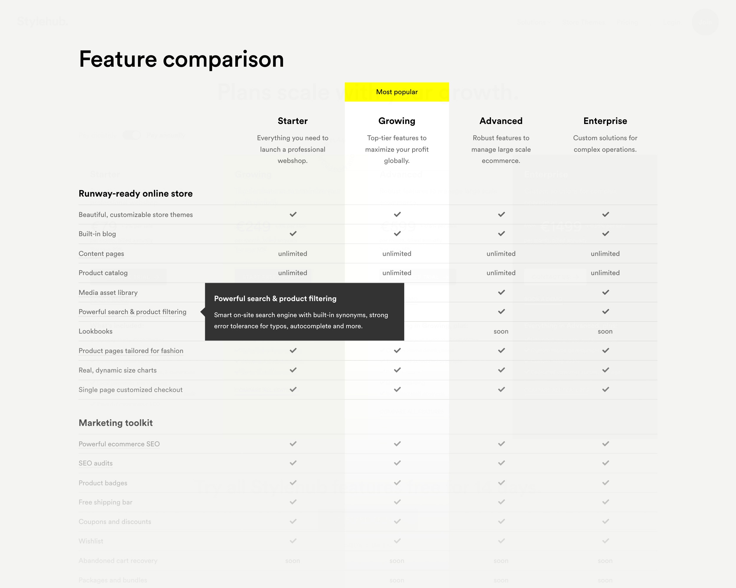
Pricing
Stylehub offers several subscription plans from starter to enterprise level, and each one has dozens of features. This amount of information is always a challenge to display, even on larger screens.
I used colors and typography to guide eyes to the recommended plan and to separate the enterprise plan from the rest. The four plans fit nicely on a laptop screen, and customers can swipe horizontally between them on mobile devices.
To keep the UI clean, I used tooltips to explain features. By clicking on the "Compare all features" button, the page scrolls down to the relevant section of the feature matrix. To improve conversions, floating call to action buttons are displayed under each plan's column.
More projects this way

Visual identity, website and more for an ecommerce platform tailored for fashion brands.
Visual identityUI/UXFrontend development

A look back at Hungary's very first online community for web designers. You can also play Invaders here.
Visual identityFull stack development

Block based theme builder framework and editor concept with high end store designs.
Visual identityUI/UXFrontend development

Analyzing the anatomy of a stock photo marketplace through my latest agency.
Visual identityUI/UXFull stack development